Tremors, or Just an Optical Illusion?
A Further Evaluation of Carlson’s Handwriting Analysis
by
Roger Viklund

A 45 degrees line screen
I am
now fairly certain why Stephen C. Carlson saw all signs of forgery in the handwriting of
Clement's letter to Theodoros.
It seems all to be due to the basis of his work; printed low resolution
images from Clement of Alexandria and a Secret Gospel of Mark by
Morton Smith.
In 2005 Stephen C. Carlson came out with
The Gospel Hoax: Morton
Smith’s invention of Secret Mark. As the title says, Carlson argued
that Morton Smith in fact invented
Clement's letter to Theodoros containing extracts from a
so-called Secret Gospel of Mark. Among the several indications
for this presented by Carlson, he also pointed to the actual writing. We
only have photographs of a now lost copy of the letter. This shows a
text that appears to be written in a hurried cursive eighteenth century
Greek handwriting. Carlson thinks that “it should be possible to tell if the
hurried handwriting of Theodore is natural or simulated.” (Carlson p.
27) He suspects that if Morton Smith forged that handwriting in the
twentieth century, imitating a hurried cursive eighteenth century
handwriting, he would have had to write much more slowly in order to
form the letters in a way which was not typical for his own way of
writing. This careful imitation where the letters are almost drawn
would, according to Carlson, lead to a number of characteristics which
could reveal the counterfeiter (and according to Carlson, this
counterfeiter, or hoaxer, was Morton Smith).
Carlson also claims to have found signs revealing this slow imitating.
He refers to a number of “[b]lunt ends at the beginnings and ends of the
lines” of the letters. This would be the effect of a very slow shaping
of the letters and that the pen thereby came to a stop and the ink would
accumulate. He also finds many instances where the pen was lifted in the
middle of a stroke and this would indicate that Smith needed to prepare
himself for writing the next letter before continuing. Occasionally
Smith still had to go back and retouch certain letters. Further Carlson
sees a lot of tremors in the writing, tremors which reasonably would not
occur if a skilled scribe would have written the letter in a fast pace.
Accordingly the tremors are also an effect of slow writing.
When I previously evaluated Carlson’s claims in the article
Reclaiming Clement's Letter to Theodoros – An Examination of Carlson’s
Handwriting Analysis, I had a tough job in extracting all the
letters for comparison. When I later systemized them and then also could
evaluate Carlson’s assertions, I was often surprised to see that I could not
find the signs that he referred to. I realize now, that I sought to find
them in places where they were not. What I did not do, and of course
should have done, was to compare my colour images, which were scanned in
1200 dpi directly from the colour photos taken by Kallistos Dourvas in
the late 70s, to the images Carlson used, which he took from the printed
images in Morton Smith’s book showing the black and white (b/w) photos
Smith took in 1958. I did at that time however, not have access to
Morton Smith’s Clement of Alexandria and a Secret Gospel of Mark.
Now that I have got hold of the book, and have scanned also these
images in 1200 dpi, I realise that the low resolution prints, done on a
printing press in the early 70s, have a line screen at a 45 degrees
angle. I had of course noticed this before and I had also previously
been updated by Scott G. Brown, who informed me of this in an e-mail.
Further, also
Walter
M. Shandruk in a blog post named
Carlson’s Handwriting Analysis on Secret Mark,
noticed how
pixelated the letters were. But the images he presents do not seem to
fully show all the details.
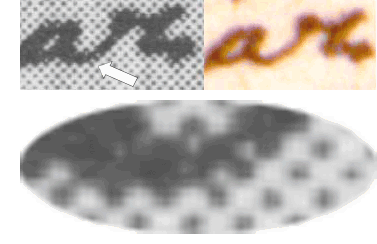
A line screen can be described as
lines
made out of separate dots of different sizes, yet organised in straight lines separated by the
same distance and reproduced at a fixed angle. In this case the angle is
45 degrees. As can be seen from the enlarged image to the right, which
is scanned from the printed black and white images of the letter
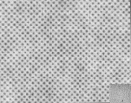 found
in Smith’s book, the dots are arranged very symmetric. When you are
printing, as in this case in black and white, there is only one colour,
and that colour is black. There will either be a black dot, or nothing
at all, just the background colour of the paper, which normally is
whitish. If you wish to produce different shades of grey, you still only
have black dots at your disposal. You
fool the eye into believing that the image is grey when viewed at a
normal viewing distance, by letting white and black areas interact with
each other. The more black dots or the larger the dots are, the darker the area
appears to be, and of course, the fewer black dots, the lighter the area
appears. The area to the right is simply a grey background area of the
letter enlarged so that the dots can be seen by the naked eye. In normal magnification the area will appear just grey, as is illustrated
by the same magnified area reduces into the small grey rectangle in the lower
right corner of the image.
found
in Smith’s book, the dots are arranged very symmetric. When you are
printing, as in this case in black and white, there is only one colour,
and that colour is black. There will either be a black dot, or nothing
at all, just the background colour of the paper, which normally is
whitish. If you wish to produce different shades of grey, you still only
have black dots at your disposal. You
fool the eye into believing that the image is grey when viewed at a
normal viewing distance, by letting white and black areas interact with
each other. The more black dots or the larger the dots are, the darker the area
appears to be, and of course, the fewer black dots, the lighter the area
appears. The area to the right is simply a grey background area of the
letter enlarged so that the dots can be seen by the naked eye. In normal magnification the area will appear just grey, as is illustrated
by the same magnified area reduces into the small grey rectangle in the lower
right corner of the image.
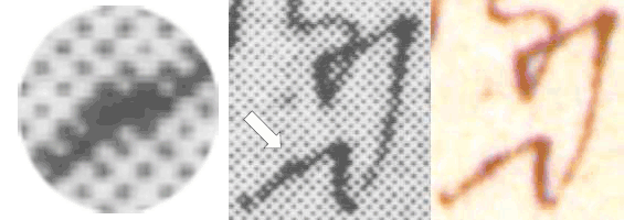
When you print for instance letters, these letters are also made up of
similar dots. However, because of the low resolution reproductions in the book,
the letters will not appear smooth in high magnification. This is due
to the
low resolution line screen. When you enlarge a halftone image very much,
like the one printed in
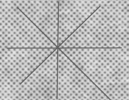 Smith's
book, you will not see an accurate representation of lines that are not
both perfectly straight and at an angle that accords with the screen. Since the dots are arranged in straight lines
with the same distance between them, you can produce straight lines only
horizontally, vertically or at 45/135 degrees angles (as the screen in
this case is in 45 degrees angle). This
is illustrated in the figure to the right. Whenever you reproduce a line
at a different angle, it will appear stepped and this could
easily be mistaken for a hesitation in drawing the letter. Since
Carlson must have looked at images similar to the ones I shall reproduce
below, I claim that the reason he saw all these signs of forgery is not
due to the fact that there are any such signs, but due the poor images
he used, in which the letters appear to be stepped, but in reality are
not.
Smith's
book, you will not see an accurate representation of lines that are not
both perfectly straight and at an angle that accords with the screen. Since the dots are arranged in straight lines
with the same distance between them, you can produce straight lines only
horizontally, vertically or at 45/135 degrees angles (as the screen in
this case is in 45 degrees angle). This
is illustrated in the figure to the right. Whenever you reproduce a line
at a different angle, it will appear stepped and this could
easily be mistaken for a hesitation in drawing the letter. Since
Carlson must have looked at images similar to the ones I shall reproduce
below, I claim that the reason he saw all these signs of forgery is not
due to the fact that there are any such signs, but due the poor images
he used, in which the letters appear to be stepped, but in reality are
not.
I will not, like I did in my previous article, make a full survey of all
the examples Carlson refers to. I will settle for including about half
of his examples, showing the most obvious
within each category, in order to
demonstrate
how and why Carlson saw
what he saw.
Nor will I refer
to from where the letters are taken, since this information is given in
my previous article
Reclaiming Clement's Letter to Theodoros – An Examination of Carlson’s
Handwriting Analysis. Those who wish to know this will have
to go there.
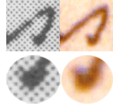
Ink blobs as a result of pen stops
 Carlson
sees “blunt
ends at the beginnings and ends of the lines”. This he
says indicates “that the strokes were written so slowly that the pen had
come to a complete stop at the ends of the strokes.” The black and white
images I present here, reasonably represent what Carlson saw. To the
right there is the sign of the cross, which in the b/w image has a
massive ending at the bottom, while the colour image shows fading colour
at the ends.
When these low resolution b/w images are magnified to this size the
shading at the ends of the letters cannot be shown, as they are
constructed of just a few large dots.
All
shades between black and white are missing.
Carlson
sees “blunt
ends at the beginnings and ends of the lines”. This he
says indicates “that the strokes were written so slowly that the pen had
come to a complete stop at the ends of the strokes.” The black and white
images I present here, reasonably represent what Carlson saw. To the
right there is the sign of the cross, which in the b/w image has a
massive ending at the bottom, while the colour image shows fading colour
at the ends.
When these low resolution b/w images are magnified to this size the
shading at the ends of the letters cannot be shown, as they are
constructed of just a few large dots.
All
shades between black and white are missing.
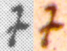
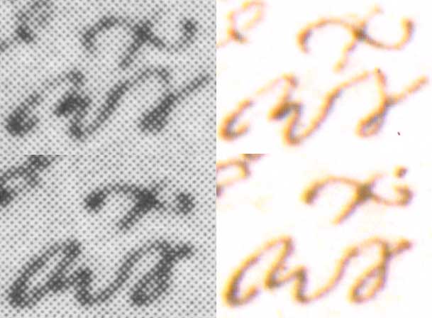
 Next
is this tau. Also this time the faded endings cannot be reproduced
in the b/w image, leading to a large blob at the bottom, when in fact
there are two intersecting lines seen in the colour image. The blob that Carlson sees below the
top loop in this tau is also a consequence of the halftone
process.
Next
is this tau. Also this time the faded endings cannot be reproduced
in the b/w image, leading to a large blob at the bottom, when in fact
there are two intersecting lines seen in the colour image. The blob that Carlson sees below the
top loop in this tau is also a consequence of the halftone
process.
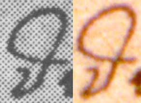
 After
that
we come to this iota, where we in the colour image can see that
there is a hook upwards to the left, while the b/w image only shows a
big blob. This is in all likelihood the
“ink blob“
that Carlson saw.
The circles below show the ending enlarged and how impossible it is to
render small details with a faded surrounding in the b/w images which
Carlson used.
After
that
we come to this iota, where we in the colour image can see that
there is a hook upwards to the left, while the b/w image only shows a
big blob. This is in all likelihood the
“ink blob“
that Carlson saw.
The circles below show the ending enlarged and how impossible it is to
render small details with a faded surrounding in the b/w images which
Carlson used.
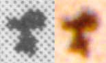
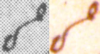 Carlson
finds another
ink blob betraying hesitation at the beginning of this upsilon.
That is at the beginning of the letter down to the left.
Looking at
the colour image, this letter do seems quite ugly, an example of poor
penmanship which could be mistaken as a sign of forgery. The line
thickness at the beginning of this stroke looks though more regular in
the colour image than in the b/w one.
Carlson
finds another
ink blob betraying hesitation at the beginning of this upsilon.
That is at the beginning of the letter down to the left.
Looking at
the colour image, this letter do seems quite ugly, an example of poor
penmanship which could be mistaken as a sign of forgery. The line
thickness at the beginning of this stroke looks though more regular in
the colour image than in the b/w one.
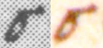 Finally
we have this sigma where the “ink blobs” look more prominent in the
b/w image than they do in the colour image.
Finally
we have this sigma where the “ink blobs” look more prominent in the
b/w image than they do in the colour image.
Pen lifts and retakes
Carlson claims that on several occasions, where a skilled
scribe would have written in one stroke, this scribe stops, lifts the
pen and begins anew. I leave aside the example Carlson gives for of a
pen
lift between epsilon and kappa, where there certainly is a
pen lift, but where this scribe always lifts his pen
as he never
connects the letter kappa to the preceding letter. For the rest,
there are obvious
examples
 where the 45 degree angle of the screen contorts the line,
creating the illusion of hesitation, retakes, or unnatural shifts in
direction. In for instance this stroke
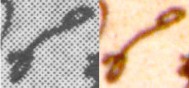
between the omicron-upsilon ligature and the circumflex accent,
Carlson sees a pen lift. That is on the middle of the long diagonal
line, which also is enlarged in the circle. On the colour image one can
clearly see that this line is drawn in one stroke, yet in a curve which
is a characteristic of this scribe when he writes this letter. However,
in the b/w image the curve appears as if there is a break in the line
and one or two retakes beginning beside/below/above the line. Now, this
is a consequence of the line screen not being able to reproduce the
curve, and instead beginning on another line of dots along the 45
degrees angle, in order to follow the letter’s curve.
where the 45 degree angle of the screen contorts the line,
creating the illusion of hesitation, retakes, or unnatural shifts in
direction. In for instance this stroke
between the omicron-upsilon ligature and the circumflex accent,
Carlson sees a pen lift. That is on the middle of the long diagonal
line, which also is enlarged in the circle. On the colour image one can
clearly see that this line is drawn in one stroke, yet in a curve which
is a characteristic of this scribe when he writes this letter. However,
in the b/w image the curve appears as if there is a break in the line
and one or two retakes beginning beside/below/above the line. Now, this
is a consequence of the line screen not being able to reproduce the
curve, and instead beginning on another line of dots along the 45
degrees angle, in order to follow the letter’s curve.
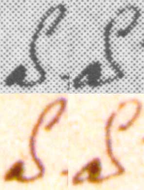
 Another
example where Carlson spots a pen lift, is between this alpha
and this tau. In my
previous study (3.5), I assumed this to be at the connection at the left
top of the
tau,
where
there is a slightly darker area which can be seen in the colour photo,
and as I did not find any other obvious signs of a pen lift. However, in the b/w
image there are signs of a pen lift in the
bottom of the curved line which
is cut out and enlarged into the ellipse below. As the lines of dots
along the 45 degrees angle continues downwards, it actually looks like a
break and a retake at the spot where the arrow points. The same curve appears to be smooth and written in one stroke
in the colour image. The bend is however impossible to reproduce smooth in the b/w
image and therefore it looks like the scribe stopped and then began a
little further to the right.
Another
example where Carlson spots a pen lift, is between this alpha
and this tau. In my
previous study (3.5), I assumed this to be at the connection at the left
top of the
tau,
where
there is a slightly darker area which can be seen in the colour photo,
and as I did not find any other obvious signs of a pen lift. However, in the b/w
image there are signs of a pen lift in the
bottom of the curved line which
is cut out and enlarged into the ellipse below. As the lines of dots
along the 45 degrees angle continues downwards, it actually looks like a
break and a retake at the spot where the arrow points. The same curve appears to be smooth and written in one stroke
in the colour image. The bend is however impossible to reproduce smooth in the b/w
image and therefore it looks like the scribe stopped and then began a
little further to the right.
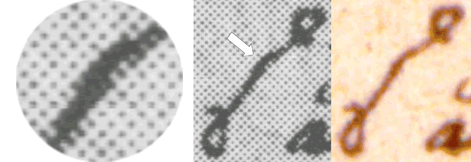
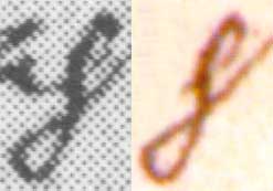
Next
we have this lambda,
where Carlson sees “[u]nnatural pen lifts in the middle of what should
be” a smooth curve in the left leg. This was one of the examples where I
in my previous evaluation was unable to see where Carlson saw the pen
lift. Now I realize that he must have taken the
 broken line on the leg down to the
left for a retake, while in reality the appearance is solely due to the fact
that in order to follow the line, which is done in
perhaps a 35 degrees angle (and also
gets narrower and then wider), the dots have to shift position as
they are following the 45 degrees angle. This break can only be seen in
the b/w image, and it is enlarged in the circle for a better view. This
also explains why in my previous study, where I used the same colour
images as presented here, I could not find any retake.
broken line on the leg down to the
left for a retake, while in reality the appearance is solely due to the fact
that in order to follow the line, which is done in
perhaps a 35 degrees angle (and also
gets narrower and then wider), the dots have to shift position as
they are following the 45 degrees angle. This break can only be seen in
the b/w image, and it is enlarged in the circle for a better view. This
also explains why in my previous study, where I used the same colour
images as presented here, I could not find any retake.
 All
of these examples show that when lines are produced at angles which
differ markedly from the angles possible to reproduce correctly, the lines will be
stepped and it will appear as if the pen was lifted and a new stroke was
done beginning on a different level. This holds true also for the next
example, where Carlson finds a pen lift between the epsilon and
gamma. The actual place where the break appears, is cut out and
enlarged in this ellipse. It really looks like the epsilon is done separately and
the gamma is connected a little bit above the epsilon. As can be seen in
the enlargement,
the line that begins at the epsilon first follows the 45 degrees
angle of the line screen, then turns left straight upwards in a 90 degree angle
along the vertical line
and the turns right to follow the 45 degrees angle again. The colour image
shows that the real angle is about 60 degrees and that there is no
break.
All
of these examples show that when lines are produced at angles which
differ markedly from the angles possible to reproduce correctly, the lines will be
stepped and it will appear as if the pen was lifted and a new stroke was
done beginning on a different level. This holds true also for the next
example, where Carlson finds a pen lift between the epsilon and
gamma. The actual place where the break appears, is cut out and
enlarged in this ellipse. It really looks like the epsilon is done separately and
the gamma is connected a little bit above the epsilon. As can be seen in
the enlargement,
the line that begins at the epsilon first follows the 45 degrees
angle of the line screen, then turns left straight upwards in a 90 degree angle
along the vertical line
and the turns right to follow the 45 degrees angle again. The colour image
shows that the real angle is about 60 degrees and that there is no
break.
 Next
we have a connection between epsilon and pi, or as
Carlson puts it
“between the pi and the epsilon”. Also this
time the line appear stepped in the b/w image. But there is no pen lift
and accordingly no retake.
Next
we have a connection between epsilon and pi, or as
Carlson puts it
“between the pi and the epsilon”. Also this
time the line appear stepped in the b/w image. But there is no pen lift
and accordingly no retake.
 Another
obvious illustration comes from the two examples of the abbreviated κυρίου where,
according to Carlson, there are “pen lifts between the initial kappa
and the final omicron-upsilon ligature”. Right at the centre of both b/w images, where the two letters
are connected, the lines are
stepped. This Carlson must have taken for a pen stop; that the scribe lifted the
pen and began anew a little bit above the stop. As can be seen in the colour images, this is not true
but an effect of the line screen not being able to produce the bend.
Another
obvious illustration comes from the two examples of the abbreviated κυρίου where,
according to Carlson, there are “pen lifts between the initial kappa
and the final omicron-upsilon ligature”. Right at the centre of both b/w images, where the two letters
are connected, the lines are
stepped. This Carlson must have taken for a pen stop; that the scribe lifted the
pen and began anew a little bit above the stop. As can be seen in the colour images, this is not true
but an effect of the line screen not being able to produce the bend.
As Carlson actually gives only three examples of retouching, and these
are closely connected with the pen lifts (one of the examples is the
lambda presented here and which according to Carlson
“shows
a lot of retouching”), I do not give any such example.
Tremors due to slow writing
 Finally
there are the forger’s tremors. Carlson writes: “The
‘forger’s tremor’ appears in the shaky quality of lines that should be
smooth curves.” But
the curves only appear not to be smooth from the low resolution line
screen of Carlson’s images. A good example is this theta, where
especially the lower part looks shaky, while none of this can be seen in
the high resolution colour image. One can see that Carlson’s
claim
that in
“the
first line of Theodore, the shakiness
is evident in the
theta
of
Θεοδώρῳ”
only holds true for the b/w
image.
Finally
there are the forger’s tremors. Carlson writes: “The
‘forger’s tremor’ appears in the shaky quality of lines that should be
smooth curves.” But
the curves only appear not to be smooth from the low resolution line
screen of Carlson’s images. A good example is this theta, where
especially the lower part looks shaky, while none of this can be seen in
the high resolution colour image. One can see that Carlson’s
claim
that in
“the
first line of Theodore, the shakiness
is evident in the
theta
of
Θεοδώρῳ”
only holds true for the b/w
image.
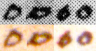 Other
good
examples are the so called squarish
omicrons Carlson spotted. He
claims that they “are so shakily written as to appear square rather than
circular”. All four omicrons which Carlson identified as being square
rather than circular are presented here. One can especially look at the
omicron furthest to the right, which is quite circular in the colour
image, but appears to be a square in the b/w image. The same pair of omicrons are presented also to the left and then magnified even more. This may demonstrate why the b/w images become distorted.
These omicrons are really small. In reality they are only about
1
Other
good
examples are the so called squarish
omicrons Carlson spotted. He
claims that they “are so shakily written as to appear square rather than
circular”. All four omicrons which Carlson identified as being square
rather than circular are presented here. One can especially look at the
omicron furthest to the right, which is quite circular in the colour
image, but appears to be a square in the b/w image. The same pair of omicrons are presented also to the left and then magnified even more. This may demonstrate why the b/w images become distorted.
These omicrons are really small. In reality they are only about
1
 mm
in diameter, and the omicron to the right, which is also enlarged
to the left, is c. 0.96 mm wide and c. 0.91 mm high.
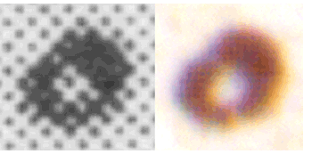
When a
small circle
is created with these dots, they are mainly following the
lines
of 45 and 135 degrees angles, forming a square standing
on its corner. If one looks at the inner circle in the centre of the omicron, which obviously is quite round, the b/w image composes of
only four white squares and the surrounding black dots can then only
follow the lines of 45 and 135 degrees angles. The
same holds true also
for the outer circle.
mm
in diameter, and the omicron to the right, which is also enlarged
to the left, is c. 0.96 mm wide and c. 0.91 mm high.
When a
small circle
is created with these dots, they are mainly following the
lines
of 45 and 135 degrees angles, forming a square standing
on its corner. If one looks at the inner circle in the centre of the omicron, which obviously is quite round, the b/w image composes of
only four white squares and the surrounding black dots can then only
follow the lines of 45 and 135 degrees angles. The
same holds true also
for the outer circle.
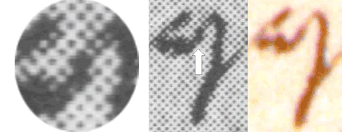
 Lines
produced
at angles which are not following the lines of the dots will appear
stepped and could
be mistaken for tremors. The
long line connecting the omicron-upsilon ligature
and the circumflex
to the right, where Carlson
sees a tremor,
is a good example of this.
This tremor can only be seen in the b/w image and is due to
the fact that the line is bending away from 45 degrees to
perhaps 30
degrees.
Lines
produced
at angles which are not following the lines of the dots will appear
stepped and could
be mistaken for tremors. The
long line connecting the omicron-upsilon ligature
and the circumflex
to the right, where Carlson
sees a tremor,
is a good example of this.
This tremor can only be seen in the b/w image and is due to
the fact that the line is bending away from 45 degrees to
perhaps 30
degrees.
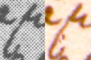 The
mu to the right, where Carlson
also sees a tremor,
is another good example. The tremor in the leg of the mu is
prominent in the b/w image compared to the colour
image.
The
mu to the right, where Carlson
also sees a tremor,
is another good example. The tremor in the leg of the mu is
prominent in the b/w image compared to the colour
image.
 Also
in these
two examples of
the letter
alpha with a smooth breathing, Carlson see tremors in the line which connects the
alpha and the
smooth breathing. It seems obvious that the stepped lines in the b/w image could be
mistaken for tremors.
Also
in these
two examples of
the letter
alpha with a smooth breathing, Carlson see tremors in the line which connects the
alpha and the
smooth breathing. It seems obvious that the stepped lines in the b/w image could be
mistaken for tremors.
 Carlson
gives three
examples of tremors in the letter rho,
and I am reproducing just one of them. Also this time the letter does
appear to be shaky in the b/w image, while none of this is
visible
in the colour image.
Carlson
gives three
examples of tremors in the letter rho,
and I am reproducing just one of them. Also this time the letter does
appear to be shaky in the b/w image, while none of this is
visible
in the colour image.
No basis for
judgement
This somewhat short survey still demonstrates that Carlson’s assertion that the handwriting of
Clement’s letter to Theodoros
shows signs of ink blobs, pen lifts, retouches and tremors, cannot withhold a
critical examination. These signs lie rather in the poor images Carlson
used than in the writing itself. The signs of forgery which Carlson
claims could be detected in the handwriting
cannot
really be used as a
basis for judgement of the letter’s authenticity, since the
quality of the images he used
is
simply too poor. On the contrary, it
can be said that the high resolution colour images do not show any
conspicuously marks of
ink blobs, pen lifts, retouches and tremors; thereby strengthening the
opinion that the text was indeed written rather swiftly. This does in
turn strengthen the opinion that the text was written by a skilled
scribe in the eighteenth century.
Copyright ©
2009
Roger Viklund
12 December
2009